
Maps serve a purpose far beyond simple navigation, they're intricate records captured in a visual form. Each element, such as lines, colours, symbols, or proportions, carries its own meaning, weaving together a story that can profoundly influence perceptions. This strong force extends to a wide range of individuals, from curious students to influential heads of state.
There are over 200 major map versions out there, each one uniquely distorting our planet's surface in distinct ways. Choosing a specific projection is anything but a neutral effort. It's an act that reveals the underlying priorities and perspectives of the viewer.
Mercator – A Common Vision
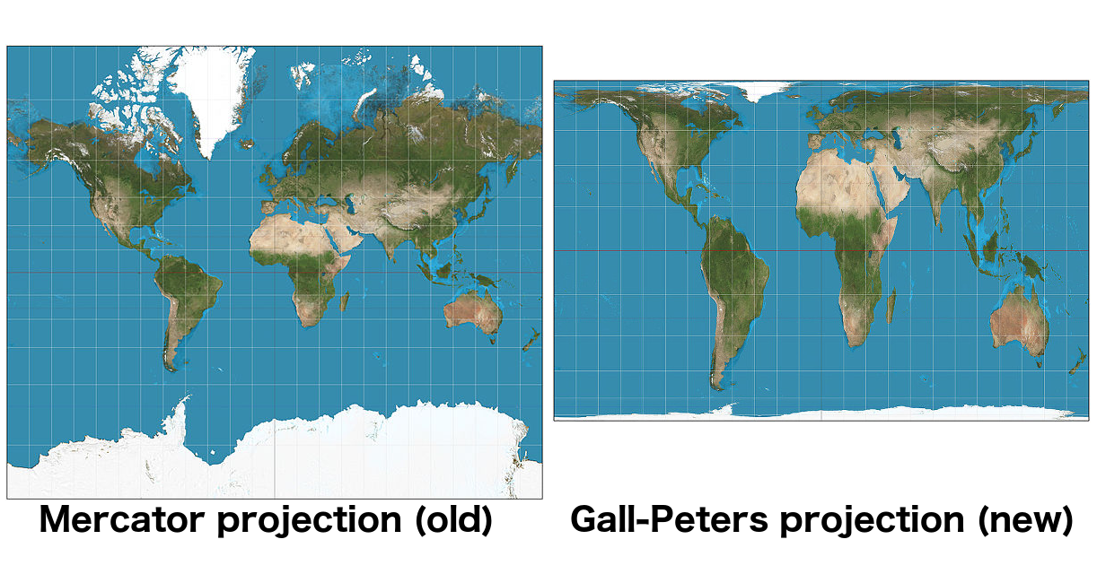
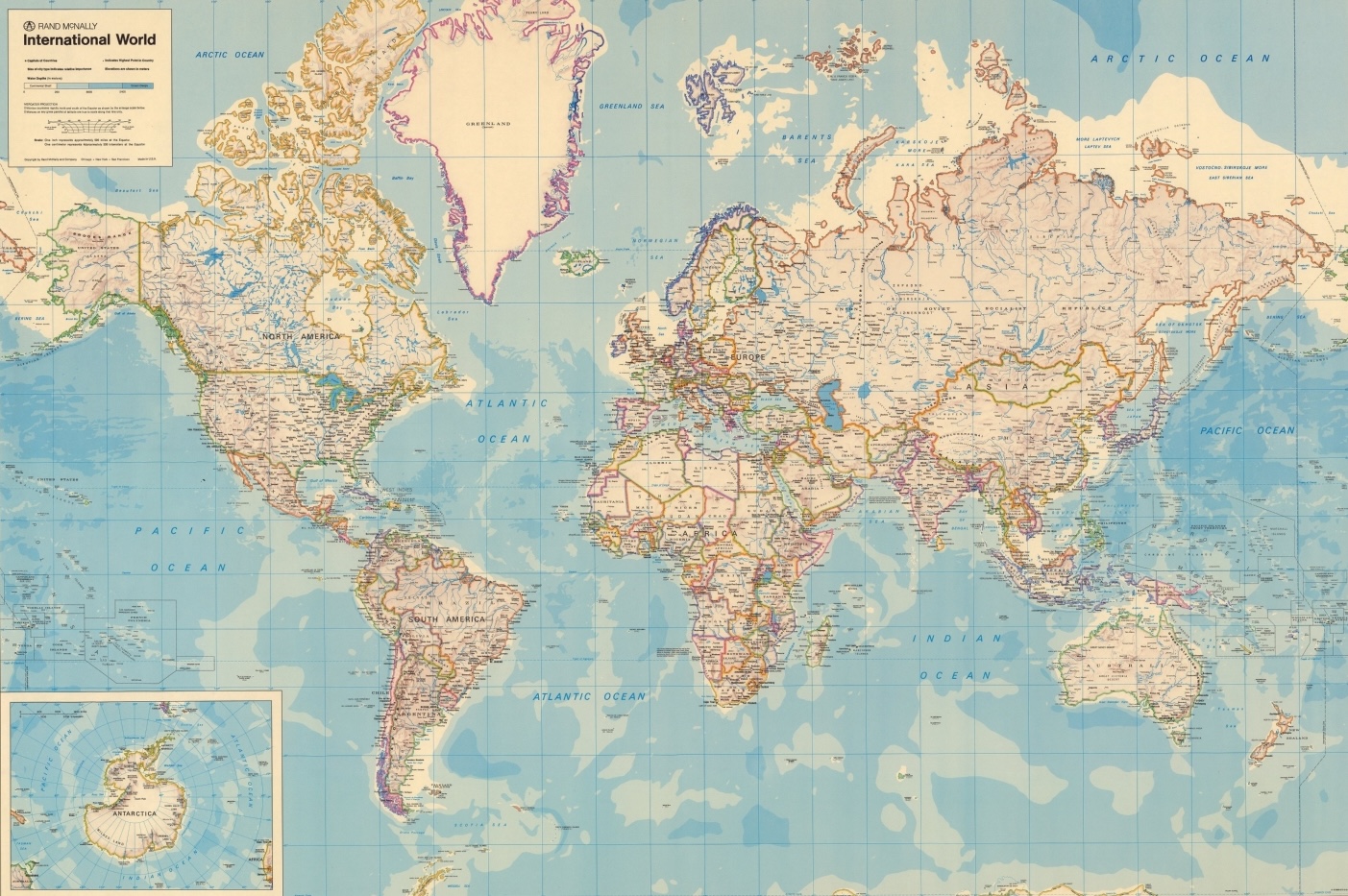
As already mentioned in the previous article, the Mercator Projection remains one of the most widely used maps in everyday life, from classrooms to digital platforms like Google Maps. This tool certainly has some benefits, such as maintaining accurate angles and shapes of continents, which is particularly beneficial for navigation at sea. All sailors rely on these precise guides to safely traverse the oceans.
Still, it's important to recognize that Mercator may not be the best fit for teaching geography, especially to young students. While many of us have grown up with a similar representation of the world, we now understand that the sizes of the continents are distorted in this flat and stretched map. Furthermore, a crucial aspect that often goes unnoticed is the misrepresentation of their actual geographic positions.
Contorted representations on world maps can significantly influence our understanding of geography, but so can their place in terms of geopolitics.
Though it may not have been apparent to us as children, a closer look reveals that school maps often reposition continents depending on the country and/or continent.
In European maps, Europe is placed at the centre; in Chinese maps, China occupies the same place. This cartographic choice subtly reinforces the notion that each society perceives itself as the centre of the world.
But Why Are We Sold This Idea?
The issue at hand revolves around control and domination, an alarming human belief that we can possess everything we see, even things we cannot catch.
A prime example of this is Africa. The continent is so vast that it's capable of containing China, the United States, Portugal, Spain, France, Germany, Italy, all of Eastern Europe, India, Japan, and the United Kingdom within its boundaries.
Throughout Africa's history, cartography has served as a powerful instrument of control. European cartographers viewed it as a landscape to be exploited, creating maps that highlighted trade routes, natural resources, and vacant areas deemed suitable for development throughout the continent. Though, in doing so, they frequently disregarded the traditions and geographical knowledge of Indigenous Africans– a choice that still holds consequences.
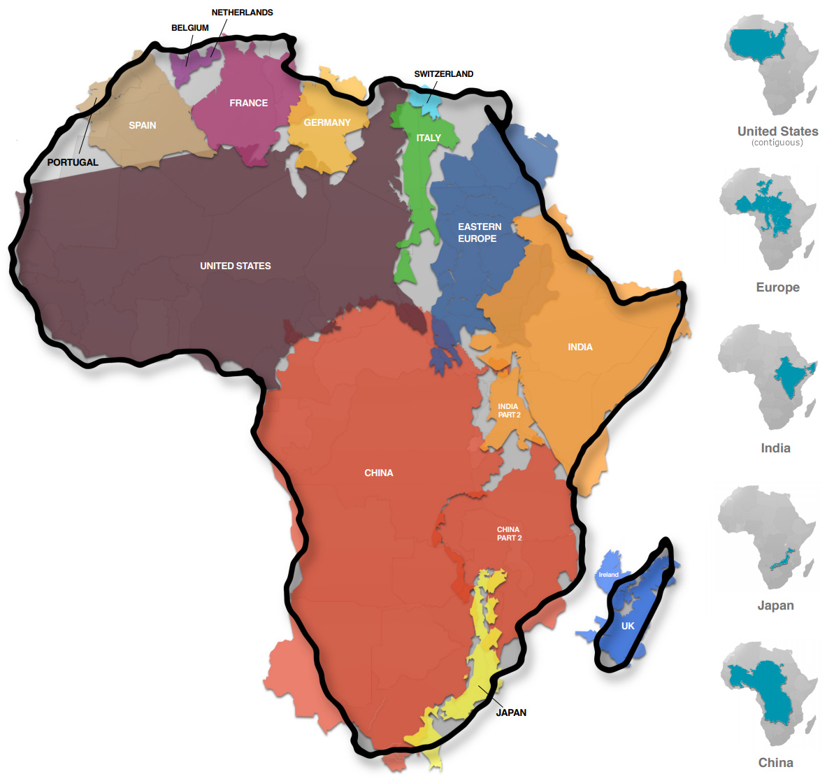
The Berlin Conference of 1885 stands as a crucial event in the history of colonialism, as it brought together European major powers to divide Africa without any representation from African nations. This conference marked a key moment in the cartographic and colonial appropriation of the continent.
In addition to the Mercator Projection, various Western narratives have permeated popular culture, media reports, and diplomatic discussions, often portraying the wide and diverse continent in a stereotypical, demeaning, and undervalued manner. Thus, the evaluation of this map can be viewed not only as an issue of geographical accuracy, but also as a broader effort to restore dignity and autonomy to African representation in global speech.
How Schools Shape the Idea of Mapping
The Gall-Peters Map is a significant topic of discussion among cartographers due to its intricate history and the controversies surrounding map projections. Initially introduced by the English astronomer John Gall in 1855, this projection received minimal attention until its publication in 1885. However, it struggled to find acceptance primarily due to its distortions, which made it unusable for navigation purposes.
In the 70s, German historian Arno Peters revived Gall's projection, presenting it as an innovative concept. Although similar to Gall's original version, it was rebranded as the "Gall-Peters Projection" and faced substantial criticism from the academic community, particularly geographers.
Peters shifted the focus of the map's promotion away from scientists, instead aiming it at humanitarian organisations operating in equatorial regions. This was in contrast to the Mercator projection, which tends to exaggerate the size of Europe and North America while minimising the size of Africa and South America. The Gall-Peters Map seeks to offer a more equitable representation of world geography, advocating for a more balanced perspective of different regions.
In this context, Boston Public Schools has proposed a notable shift in its geography curriculum, moving away from the traditional Mercator Projection in favour of the Gall-Peters Projection.
Framed as an effort to “decolonise” the curriculum, the initiative carries particular value given the district’s predominantly Black and Latino student population.
However, this might not be the idea of the century. It's essential to note that all maps involve some form of distortion. The Gall-Peters one focuses on representing land area accurately, but it obviously has its own limitations, particularly in terms of distortions near the equator and poles.
Despite its historical significance and ongoing use by institutions such as UNESCO and the Vatican, the Gall-Peters Projection is not really the favourite among modern cartographers. Many professionals prefer projections such as the "Winkel Tripel" or "Robinson", which offer a more balanced picture of geographical features. The Mercator Map, nonetheless, continues to be widely used, particularly in navigation tools such as Google Maps.
To foster a deeper understanding of geography among students, educators are encouraged to introduce a variety of map projections. This method allows for a critical examination of the strengths and weaknesses of each one and facilitates a comparison with globes, ultimately providing a more comprehensive perspective of the world.
Why Is Updating Maps Harder Than It Seems?
Implementing changes in global map production presents some challenges. A substantial issue lies in the lack of a unified authority supervising map making; therefore, even if the United Nations were to endorse the widely acclaimed “Equal Earth Projection”, who aims to reestablish Africa’s true form on the World Map, other representations could still be utilised by different people.
Cartographers are often tasked with revising world maps to reflect updates in names and borders, but these shifts don't always meet with immediate blessing.
For instance, after the Czech Republic adopted the name “Czechia” as its official English name in 2016, cartographers made the necessary adjustments to English-language world maps. Although the technical process of updating the models was straightforward, gaining widespread acceptance of this new name has proven to be more challenging.
The same thing happened in 2022, when Türkiye formally requested that all international organisations employ the name "Türkiye" instead of "Turkey". This choice was part of a broader rebranding effort to reflect more accurately Turkish culture and national identity; yet, to this day, the majority of people continue to use the old term, either out of habit, lack of awareness, or resistance to change, highlighting the complexities involved in reshaping global perceptions and linguistic conventions.
A person's mental image of the world is often established during childhood, making early exposure to different cartographic representations significant. Even the transition to the Equal Earth Projection may take years to fully impact how individuals perceive geographical associations.
While simply adopting this new projection will not rectify centuries of skewed representations or ensure fair global relations, it designates a meaningful effort towards enhancing Africa's visibility and importance on the world stage.
A Good Reason?
Colonialism is certainly highlighted as the main reason why many countries continue to use flat maps with Europe at the centre. Nevertheless, the choice of map orientation is influenced by various practical aspects.
For instance, when attempting to shift the centre of the map to America, the result is a map focusing on the Pacific Ocean. This design tends to compress lots of geographical areas to the edges, obscuring their presence. It also cuts Asia in half, making it difficult to grasp the proximity of Asian countries to one another, which complicates the understanding of regional associations.
Centring the map on Australia presents even greater challenges. This orientation emphasises the largely uninhabited expanses of Far Eastern Russia and the Pacific, leaving major global cities situated at the borders of the map.
In contrast to the "good cause", maintaining a Europe-centred map optimally balances the representation of populated landmasses while minimising the area dedicated to the sparsely populated Pacific. This positioning preserves the visibility of major inhabited regions and avoids cutting through significant population centres.
Thus, despite the obvious flaws in every map orientation, the Europe-centred map emerges as a pragmatic solution, reflecting a mix of historical context and geographical logic.
Despite the significant advancements in technology, creating a flawless map that accurately represents reality, while addressing conflicting perspectives, remains an impossible task.
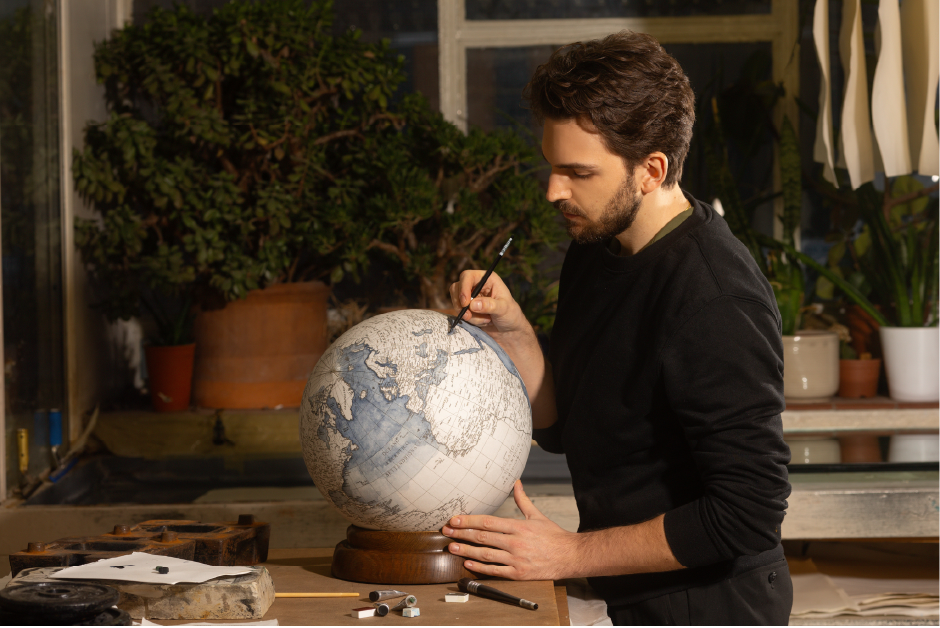
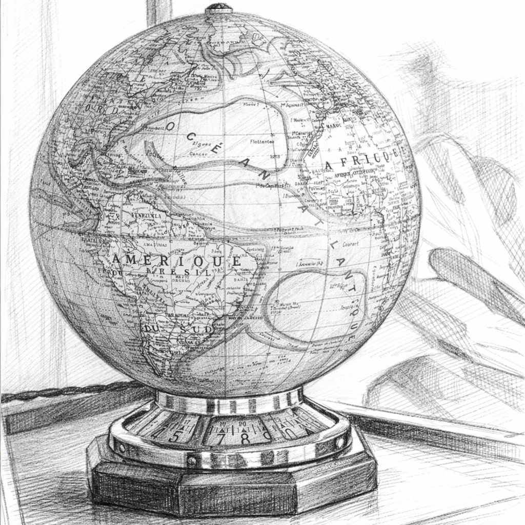
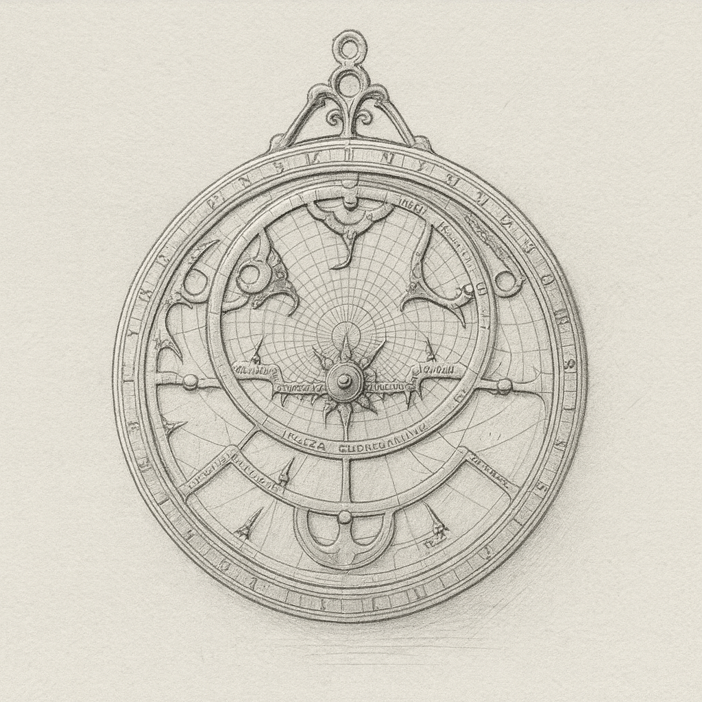
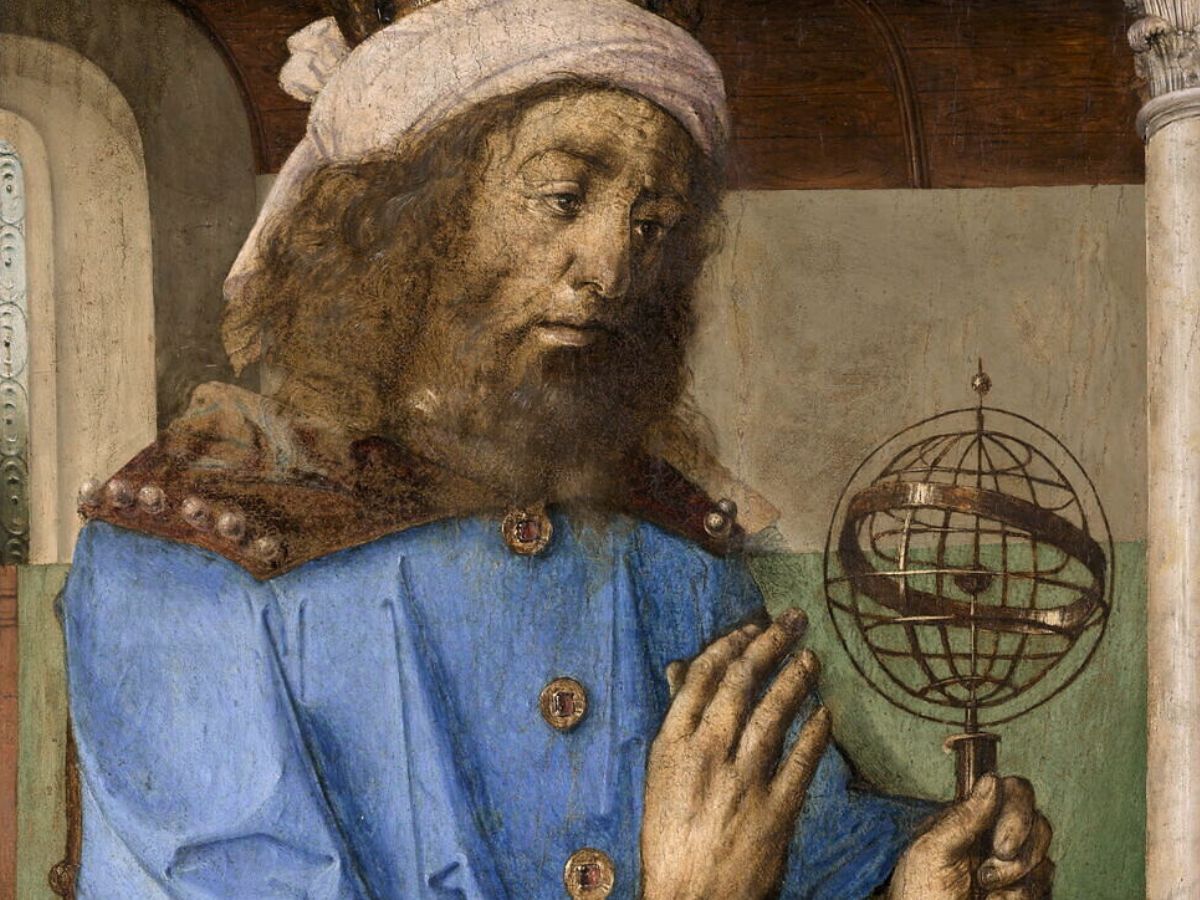
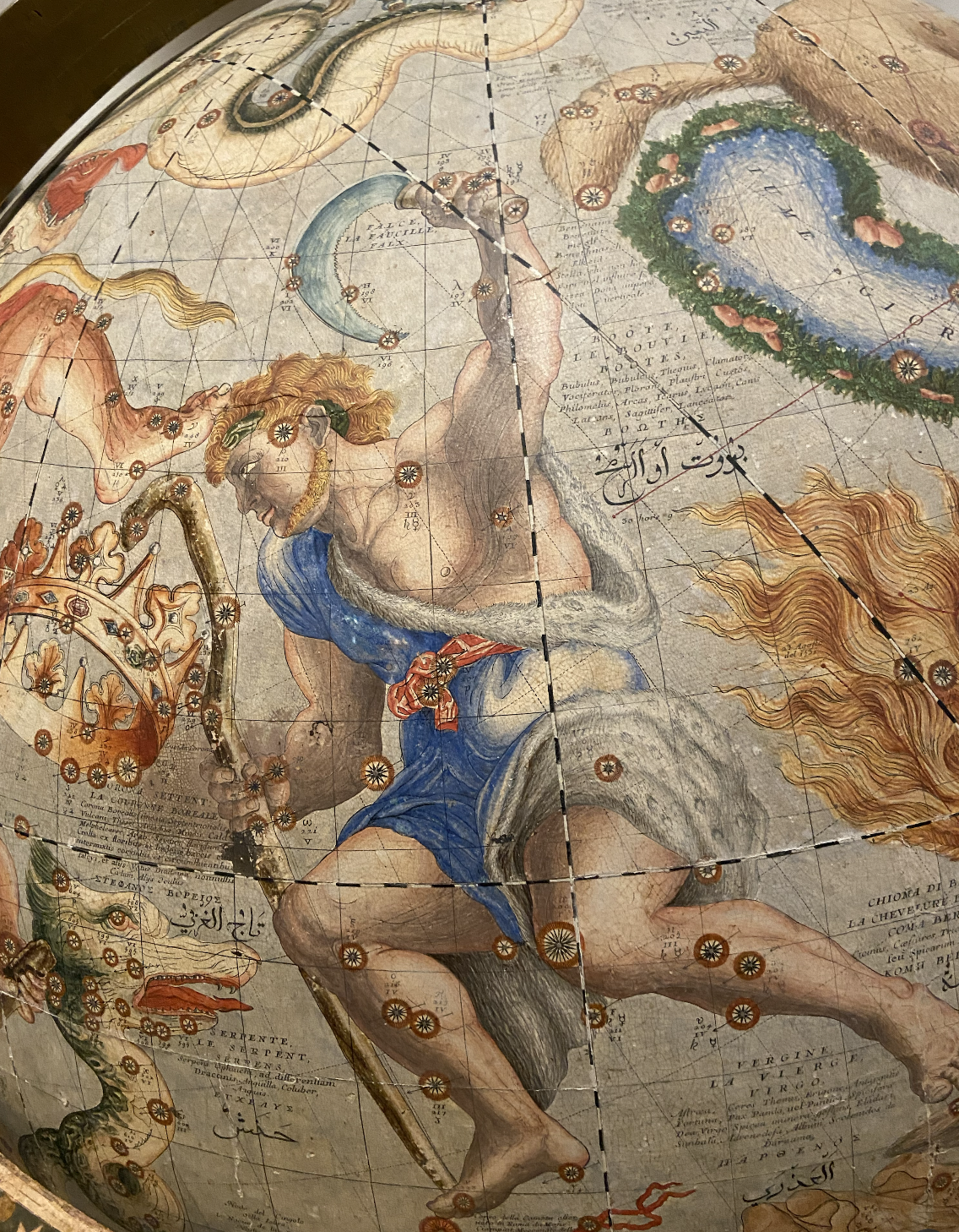
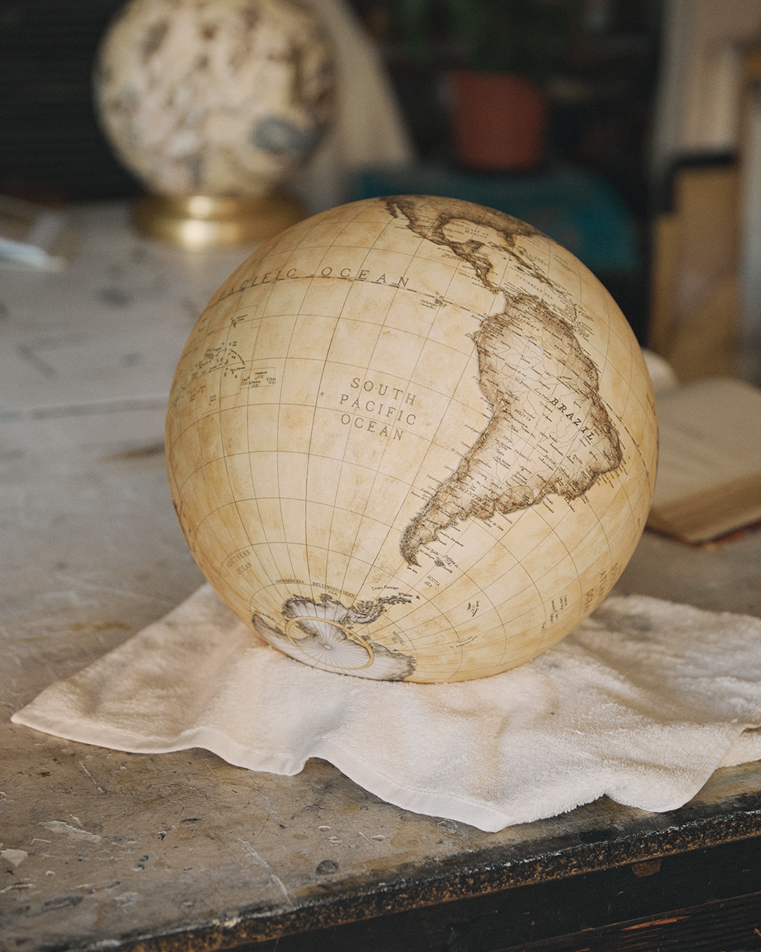
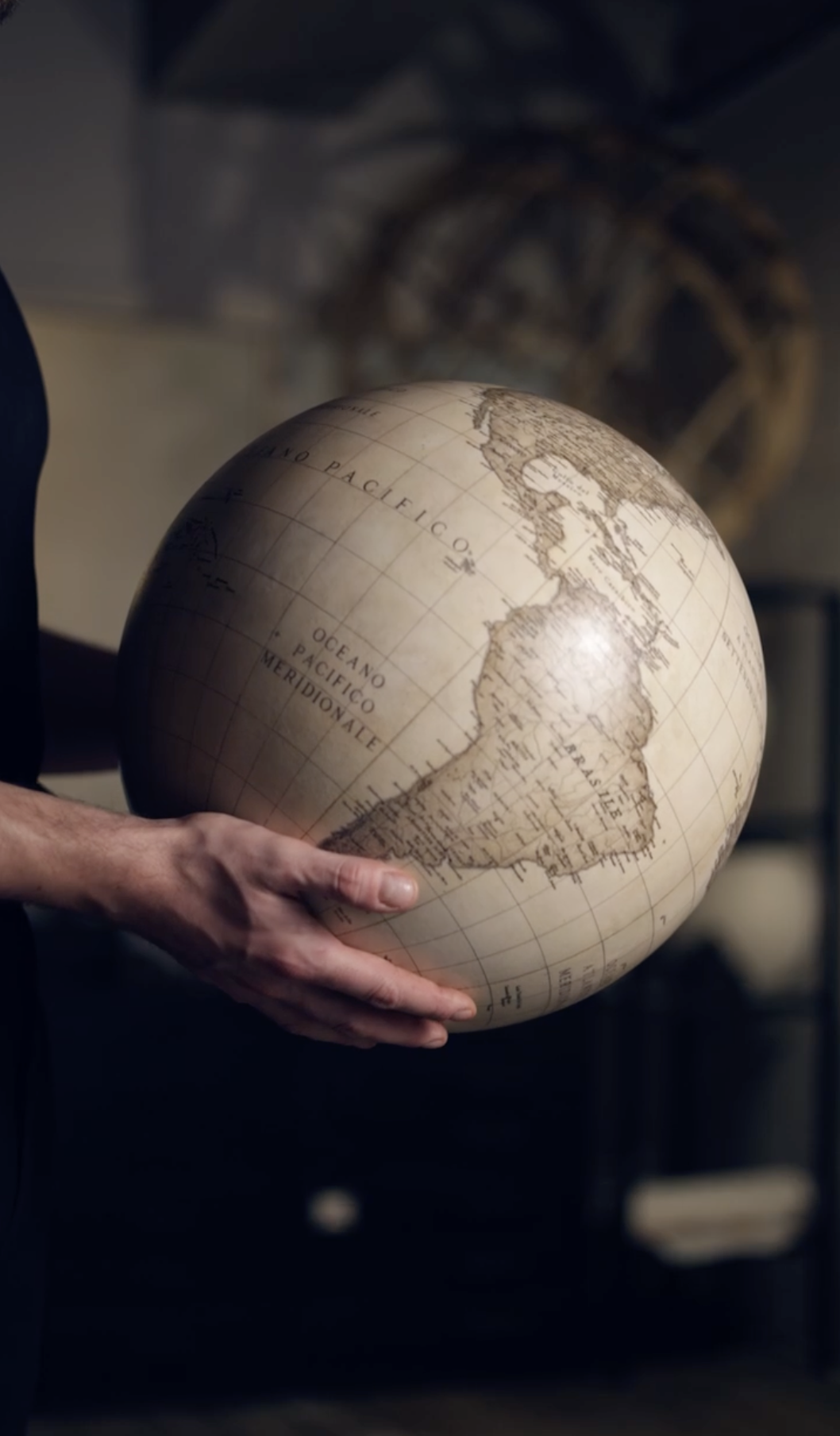
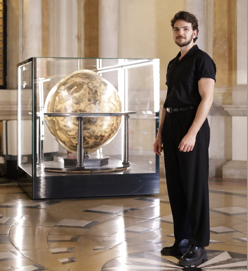
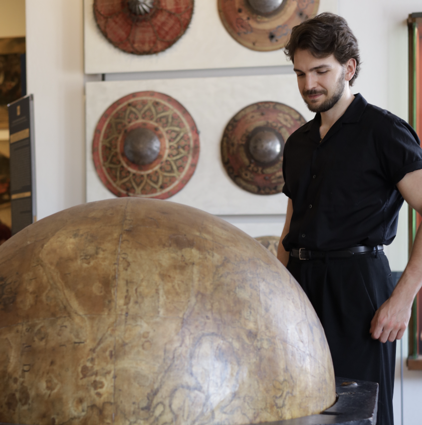
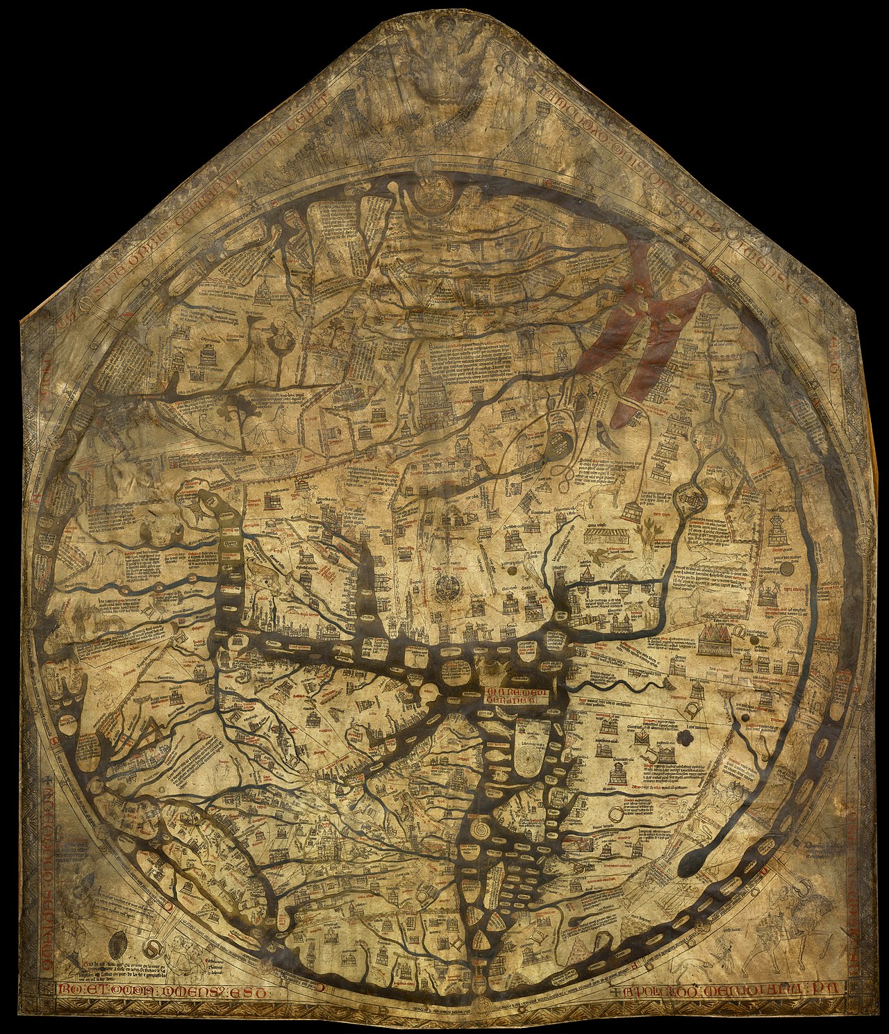
In this context, globes serve as a valuable resource. The creativity and skill of early cartographers have provided us with beautiful representations of the Earth that continue to be appreciated today.
Globes are often used alongside basic school maps to help students better understand the complexities of our planet's geography, offering a valuable and engaging way to visualise countries' connections and global scale.


.avif)