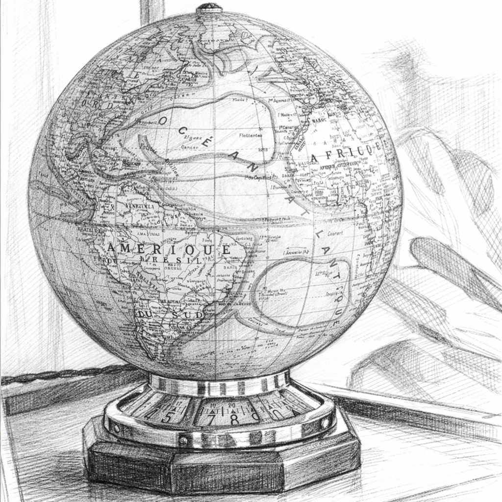
Maps are essential tools in our daily lives. We rely on them to explore locations, cities, and even entire countries. Whether for personal use, scientific research, or professional purposes, maps serve a wide range of functions. In summary, their usefulness is vast and varied.
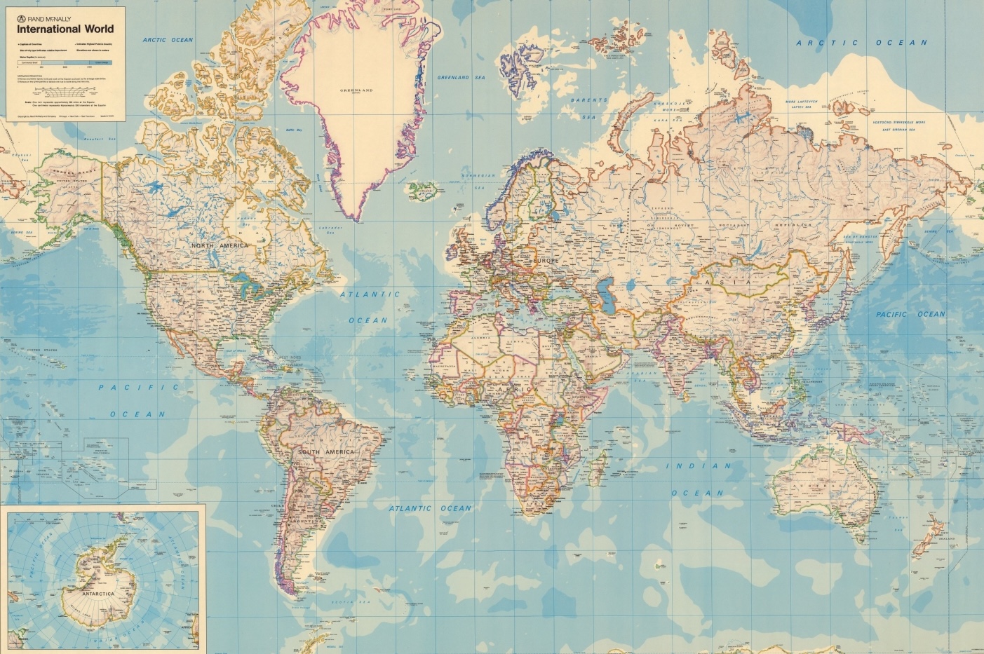
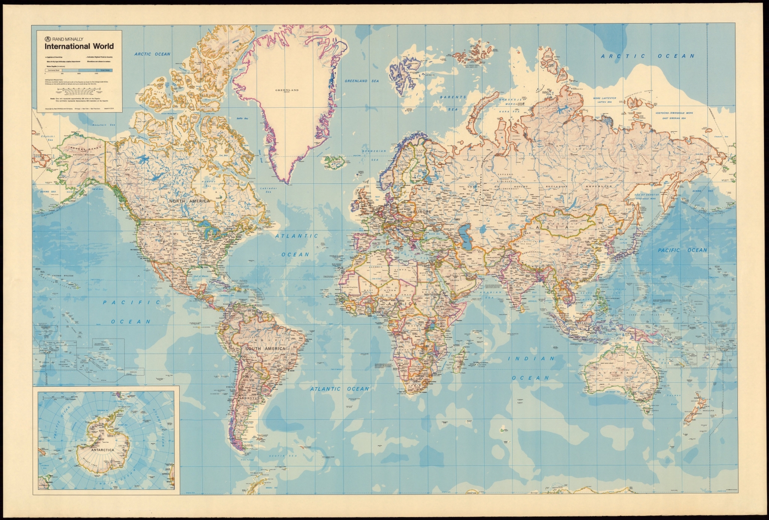
The Earth's representation on traditional maps, whether digital or printed, often conveys a sense of order and perfect symmetry among the continents. However, this image doesn't accurately reflect the true nature of our planet's geography. When stretching any map in all directions, the continents appear elongated, distorted, or vary in size compared to the commonly held perception. This discrepancy reveals a more complex and fascinating reality about the globe's surface.
But where does the current map originate from?
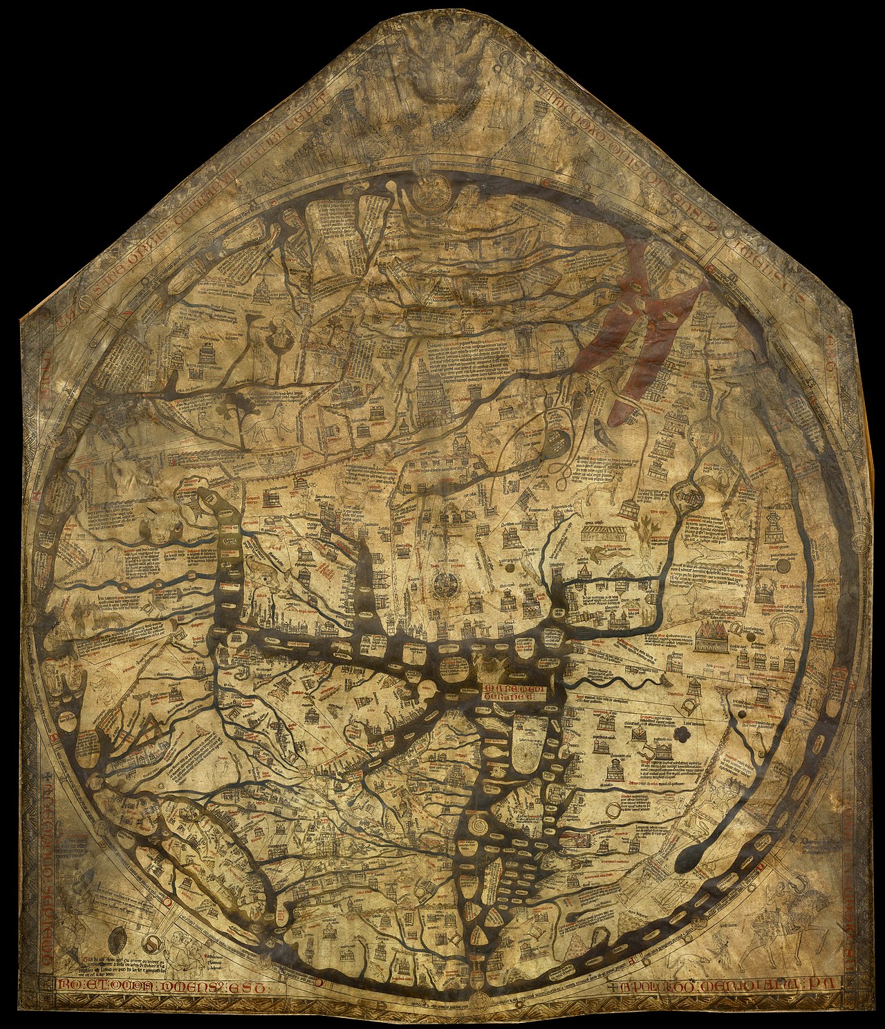
The Earth, as we know it, is heavily inspired by the Mercator Projection, a tool used for nautical navigation that eventually became the world’s most widely recognised guide.
This map is a cylindrical projection that uses a combination of geometric and analytic methods to create isogonic maps, which maintain equal angles along any course. It's predominantly employed in nautical charts due to its effectiveness in depicting lines of constant course angle, known as "rhumb lines".
One key feature of the Mercator Projection is its ability to maintain a uniform distance scale in all directions around any given point. This allows for an accurate representation of angles and shapes of small objects. However, it's crucial to note that while the projection accurately preserves angular relationships in local areas, it increasingly distorts the size and shape of larger features as one moves away from the equator toward the poles, where the scale can become infinitely large at higher latitudes.
Distorted representations on world maps can significantly influence our understanding of geography. For instance, Greenland is often depicted as nearly the same size as Africa; however, Africa is actually 14 times larger. Similarly, Europe is shown as larger than South America, despite South America having a greater land area. The dimensions of Canada and Russia are also commonly exaggerated; if these countries were placed closer to the equator, their true scale would become more apparent.
Cartographic Representations
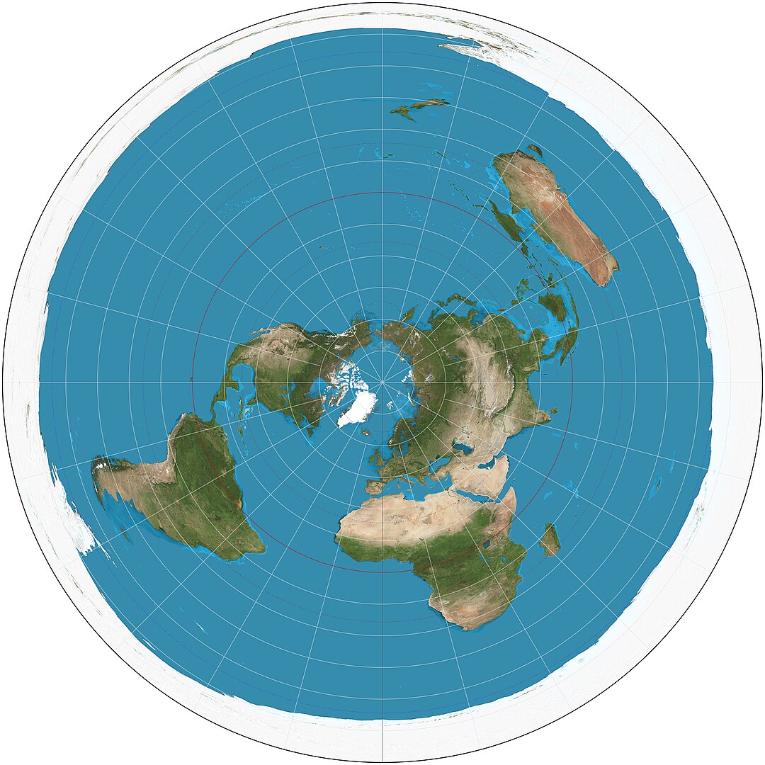
In order to represent the Earth's curved surface on a flat medium like a map, some distortion is unavoidable but necessary. The Earth can be viewed from different perspectives, leading to the creation of various cartographic projections.
To minimize mistakes in representation, identifying potential inaccuracies is essential. These errors can manifest as alterations in surface areas, distances, or angles between locations.
Geographic maps are engaging tools that come to life through a variety of construction methods, each designed to serve a unique purpose. They diverge into "Equivalent Maps", "Isogonal (or Conformal Maps)", and "Equidistant Maps".
The Equivalents Maps may warp angles and distances, but they excel at keeping the areas proportional to their real-life counterparts. Think of cadastral maps, essential to identify property boundaries and sizes.
The Isogonal ones prioritise angles instead, ensuring they mirror those on the ground, even if that means altering areas and distances. Nautical maps are a prime example, guiding sailors with precise angle representations to navigate safely through oceans.
Lastly, we find the Equidistant Maps. True to their name, they maintain a consistent proportion between actual distances and those depicted on the map. Road maps fit this category perfectly, allowing travellers to measure the path ahead with confidence.
Each type of map serves its own purpose, transforming our understanding of geography and enhancing our navigation experiences.
Cartographic projections are essential for effectively representing our planet, but it's important to recognise that they cannot satisfy all three conditions at once; each projection can only prioritise two. This limitation highlights the value of understanding the perspective from which the Earth is depicted.
Modified projections derive from projections in which deformations have been reduced through the application of mathematical formulas, while conventional projections or representations are obtained through mathematical relationships existing between the various points on the Earth's surface and corresponding to points on the map.
The most commonly used modified projection is the Mercator Projection, which is Isogonic, meaning it plots sea or air routes that intersect meridians at a constant angle. This characteristic allows for navigation with a compass without the need for external reference points, which has been a hallmark of this style of cartography.
Authagraph
A rectangular world map called "AuthaGraph" is currently recognised as one of the most effective representations of the Earth. Developed in 1999 by Japanese architect Hajime Narukawa, it consists of an equal-area projection. It was created by dividing the globe's spherical surface into 96 triangles, then transferring it to a tetrahedron while preserving area proportions, and unfolding it into a rectangular shape, resulting in a polyhedral map projection.
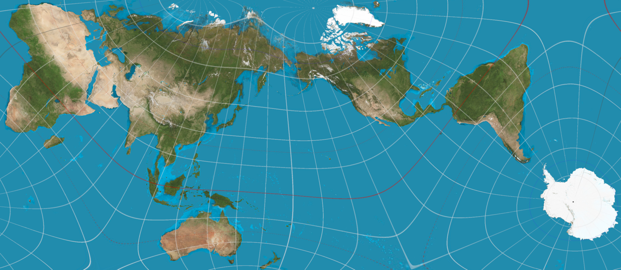
Its ability to maintain the sizes and shapes of continents and oceans significantly reduces distortions. Unlike Mercator, which inflates the size of landmasses in higher northern latitudes, the AuthaGraph map accurately represents all areas, including Antarctica, which is displayed in its entirety. In addition to the rectangular format, the same method allows for the creation of triangular world maps.
Mapping Accuracy – The African Union's Stand
Recently there's been a growing wave of discussion and debate surrounding the accuracy of the maps we frequently rely on in our daily lives. This escalating conversation has not only captured the attention of various media platforms, but it has also sparked the interest of government leaders across the globe. In light of this, many officials are beginning to advocate for a shift towards a map that better represents our world as we sense it, aiming for a more truthful depiction of reality.
In this context, the African Union has stepped forward, aligning its voice with calls to move away from the traditional Mercator map. This well-known projection has often distorted the true size of nations and continents, particularly the African continent. This Union's campaign highlights the urgent need for a mapping solution that accurately reflects the vastness of Africa, fostering a deeper understanding of the landmass's significance and diversity in the global landscape.
Member states have shown support for the map campaign. Selma Malika Haddadi, deputy chair of the African Union Commission, expressed concerns to Reuters about the Mercator, stating that it creates a misleading perception of Africa as "marginal." This is especially significant, given that Africa is the world’s second-largest continent, home to over 1 billion people, and the African Union itself comprises 55 member states.
Haddadi noted that such geographic stereotypes can impact media portrayal, educational content, and policy-making. While criticism of the Mercator Projection has been ongoing, the "Correct the Map" campaign spearheaded by advocacy groups "Africa No Filter" and "Speak Up Africa" has reignited this important discussion. The campaign encourages organisations to adopt the 2018 "Equal Earth Projection", which aims to provide a more accurate representation of countries' sizes.
The African Union has endorsed this campaign, noting that it aligns with its goal of reclaiming Africa’s rightful place on the global stage, especially amidst growing calls for reparations for colonialism and slavery. They're advocating for the wider adoption of this map and engaging in discussions about collective actions with its member states.
Fara Ndiaye, a co-founder of Speak Up Africa, emphasised that the Mercator Projection negatively impacts the identity and pride of Africans, particularly children who may encounter it early in their education.
They are actively promoting a curriculum in which the Equal Earth Projection will be the primary standard in all African classrooms. She also hopes that this system will be adopted by global institutions.
The Future of Mercator Maps
The Mercator Projection remains a popular choice among schools and technology companies. In 2018, Google Maps transitioned from utilising the Mercator system on the desktop, to a 3D globe view– although users still have the option to revert to the old view if they want to. On the mobile platform, however, the Mercator Projection continues to be the default setting.
The initiative "Correct the Map" is advocating for organisations like the "World Bank" and the "United Nations" to adopt the Equal Earth map Projection. A representative from the World Bank pointed out that the institution already employs the "Winkel Tripel Projection", or Equal Earth, for its static maps and is in the process of reducing its use of the Mercator Projection for web-based maps.
A representative from the UN mentioned that once they receive the request, it will undergo a review and approval process by a committee of experts.
Support for the African Union's efforts is also emerging from other regions. Dorbrene O’Marde, the vice-chair of the Caribbean Community (Caricom) Reparations Commission, has endorsed the Equal Earth projection as a counter to the Mercator map’s ideology of power and dominance.
How maps are designed and presented can significantly influence our perceptions of power, relevance, and identity on a global scale. Their distortion in scale can subtly shift our understanding of the political dynamics, economic opportunities, and cultural identities.
They could perpetuate stereotypes and reinforce existing hierarchies, affecting how these areas are perceived in the broader context of international relations and development.
As a result, the implications of these visual cues extend beyond cartography, influencing our worldviews and the narratives we construct about relevance in the global landscape.


.avif)